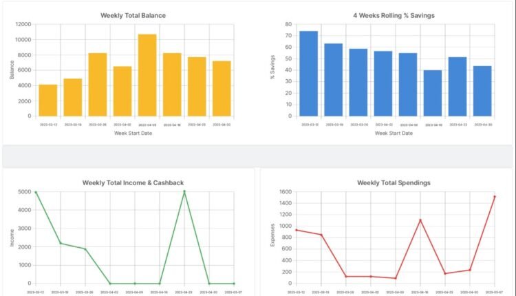
Data Visualisation and Dashboarding: Designing Interactive Reporting and KPIs Using Tableau or Power BI for Actionable Insights
Data is only valuable when it can be understood and acted upon. In most organisations, decision-makers do not have the time to scan raw tables, interpret complex SQL outputs, or decode long reports. They need clarity, speed, and confidence. This is why data visualisation and dashboarding have become essential skills in analytics teams. A well-designed dashboard turns scattered metrics into a single, interactive view of performance, risks, and opportunities. It helps stakeholders ask better questions and take timely action based on evidence rather than instinct.
Tools like Tableau and Power BI make dashboard creation accessible, but the real impact comes from design choices. The most effective dashboards are not just attractive. They are structured for decision-making, driven by business context, and built with measurable KPIs that reflect what truly matters.
The Foundations of Strong Dashboard Design
A dashboard is not a collection of charts. It is a guided story that answers specific business questions. Strong design begins by defining the audience and the decision they need to make. For example, a sales head may need pipeline coverage and conversion trends, while a support manager may focus on ticket volume and resolution time.
Once the purpose is clear, the design should follow three principles:
Clarity over decoration
Avoid overly complex visuals, heavy colour usage, and crowded layouts. Each chart should have a clear reason to exist.
Consistent structure
Use a predictable layout so users can scan quickly. Place high-level KPIs at the top, supporting trends in the middle, and diagnostic breakdowns at the bottom.
Context with comparison
A KPI without context is incomplete. Users need reference points such as targets, previous periods, or benchmark ranges to interpret performance.
These fundamentals are often reinforced in practical learning environments, including business analyst classes in chennai, where learners build dashboards that balance stakeholder expectations with real-world data constraints.
Designing KPIs That Drive Decisions
KPIs are the backbone of dashboarding. If KPIs are poorly defined, dashboards become misleading or irrelevant. Effective KPIs are specific, measurable, and aligned to a business objective.
A practical approach to KPI design includes:
Define the business outcome first
Instead of starting with available data fields, start with the outcome. For instance, “improve retention” or “reduce delivery delays.”
Map KPIs to controllable actions
A KPI should connect to levers that teams can influence. For example, “average order processing time” is more actionable than a vague “operational efficiency score.”
Avoid vanity metrics
Page views, downloads, or raw sign-ups can look impressive but may not reflect meaningful progress. KPIs should signal value, not noise.
Document KPI logic
Every KPI should have a clear definition, calculation method, and data source. This avoids confusion and ensures consistency across teams.
When KPIs are designed properly, dashboards become tools for alignment. Teams speak the same language, interpret results consistently, and act faster.
Building Interactivity for Exploration and Root Cause Analysis
Interactive dashboards help users move from “what happened” to “why it happened.” Tableau and Power BI offer features like filters, drill-downs, slicers, tooltips, and cross-highlighting. These capabilities allow users to explore patterns without waiting for new reports.
Good interactivity is purposeful. It should not overwhelm users with too many options. A useful approach is to design dashboards with two layers:
Executive view
This layer focuses on summary KPIs and trends, showing whether performance is improving or declining.
Diagnostic view
This layer supports deeper exploration, allowing users to segment results by region, product, customer type, or time period.
For example, if revenue dips, users should be able to quickly isolate whether the cause is a specific region, a product category, or a drop in conversion rate. Interactivity shortens the path from insight to action and reduces dependency on ad-hoc analysis requests.
Practical Tool Choices: Tableau vs Power BI in Real Projects
Both Tableau and Power BI are widely used, but the best tool depends on context.
Tableau strengths
Tableau is known for powerful visual exploration, strong dashboard flexibility, and smooth handling of interactive analytics. It is often preferred when data storytelling and advanced visual design are priorities.
Power BI strengths
Power BI integrates well with Microsoft ecosystems, supports strong data modelling, and offers DAX for KPI calculations and measures. It is often cost-effective for organisations already using Microsoft tools.
Regardless of tool choice, the workflow remains similar: connect data sources, clean and model data, define measures, design visuals, validate logic, and publish dashboards with refresh schedules and access controls. Many learners develop these end-to-end skills through hands-on formats such as business analyst classes in chennai, where the focus is not only on tool usage but also on analytical thinking and stakeholder alignment.
Conclusion
Data visualisation and dashboarding are essential for translating data into decisions. Tools like Tableau and Power BI provide the platform, but impact comes from strong design principles, meaningful KPIs, and purposeful interactivity. A well-built dashboard reduces confusion, supports faster decision-making, and creates shared visibility across teams. When dashboards are grounded in business objectives and built with clear logic, they become reliable instruments for performance management and continuous improvement, not just reporting screens.


Comments are closed.